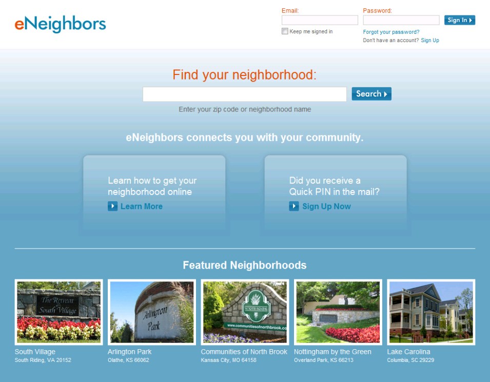
We set out to improve the eNeighbors.com homepage in the following ways:
- Make it easier/quicker to sign in
- We added a sign in module to the homepage in the upper-right hand corner. When you first load the page the cursor defaults to the email address field so you can just start typing.
- We added a “Keep me signed in” check box. When you check this box, you won’t have to sign in when you come back to the site, unless of course, you click the “Sign Out” link or remove cookies from your computer
- We increased the visibility of the “Forgot your password?” link so if you forget your password or it doesn’t seem to be working, you know how to quickly reset it
- Make it easier to find neighborhoods
- Before, you could only search by ZIP code, but what if you don’t know the ZIP code or you would rather search by name. Now you can search by neighborhood name. Give it a try. Go to http://www.eneighbors.com/ and search for “Nottingham”.
- Expanded the search box, put it in the center of the page
- Make it clear as to what eNeighbors does, in one sentence
- Added short value proposition statement “eNeighbors connects you with your community.”
- Help first time users get to the sign up form
- Added text near the sign in module with a link to Sign Up form
- Added large call-out for users who received a PIN in the mail
- Make it more inviting
- Added “Featured Neighborhoods” section to showcase neighborhood entrance photos, which gives it a more neighborhood feel
- Make it easier to read
- We increased the page width and font size across the board
We wanted to do all this but at the same time, keep the design consistent with our old design so users would feel that it was familiar. One final note, we also added a link to “Email Support” in the footer of every page so users would be able to reach us quickly.
New and old homepage screenshots for comparison are below.
NEW
OLD


Love the new look and upgrades! Thanks for all you do, Chris!
Amy
Thanks Amy.